-
Shop
- Adidas
- Advanced Technologies
- Apple Accessories
- Best-Sellers
- Car Accessories
- Dating & Social Skills
- Digital Resources
- AI Skills
- Beauty
- Car Buying & Ownership
- Cozy Feast Collection
- Electronics & Technology
- Financial Education
- Hobbies
- Home Styling & Organization
- Mindset
- Online Business
- Parenting & Child Development
- Personal Style & Fashion
- Pet Lifestyle & Wellness
- Smart Life with AI
- Travel Planning
- Wellness
- Yoga & Fitness
- Education & Learning
- Family & Parenting
- Fashion
- Alexander McQueen
- Bags
- Bags & Wallets
- Balenciaga
- Belts
- Blazers
- Blouses & Shirts
- Bottega Veneta
- Brunello Cucinelli
- Burberry
- Chanel
- Chloé
- Dior
- Dolce & Gabbana
- Dresses
- Etro
- Fendi
- Gucci
- Hats & Hair Accessories
- Jacquemus
- Jewelry
- Jil Sander
- Keychains
- Kiton
- Luggage
- Luggage Bags
- Miu Miu
- Off-White
- Outerwear
- Prada
- Rick Owens
- Saint Laurent
- Socks & Tights
- The Row
- Tom Ford
- Valentino
- Valentino Garavani
- Versace
- Vivienne Westwood
- Watches
- Furniture
- Gadgets
- Health & Beauty
- Health & Wellness
- Home & Garden
- Kids & Babies
- Kitchen
- Lighting
- Patio, Lawn & Garden
- Personal Growth
- Pet Care
- Pet Supplies
- Pets
- Shoes
- Sport & Outdoors
- Stress Relief & Relaxation
- Travel
- Wealth
- Popular
- Best deals
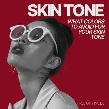
Colors to Avoid for Your Skin Tone: Quick Checklist

What Colors to Avoid for Your Skin Tone: An Easy Personal Style Checklist
Some colors make skin look clear and energized; others can make it appear dull, sallow, or overly flushed. This practical checklist focuses on shades that commonly fight with different undertones and contrast levels, plus quick at-home tests to narrow down what to skip and what to swap in instead.
Start with two quick checks: undertone and contrast
Undertone is the subtle hue under your skin (warm, cool, or neutral). Contrast is the light–dark difference between your hair, skin, and eyes (low, medium, or high). Together, they explain why a color can look “right” on a hanger but look off the moment it’s near your face.
- Undertone: warm (golden/peach), cool (pink/blue), or neutral (mix).
- Contrast: low (hair/skin/eyes close in value), medium, or high (strong light–dark difference).
- Fast warm vs. cool check: compare gold vs. silver jewelry near the face; note which makes skin look brighter and more even.
- Fast contrast check: take a no-makeup photo in daylight; observe whether bold black/white overwhelms (often lower contrast) or looks crisp (often higher contrast).
Face-framing color warning signs (what “off” looks like)
| If you notice… | It often means… | Try swapping to… |
|---|---|---|
| Skin looks gray or tired next to the color | Shade is too cool or too muted for your undertone/contrast | A warmer or clearer version of the same hue |
| Redness looks amplified | Shade is too warm/orange or too saturated | Cooler rose, berry, or softer/less saturated tones |
| Dark circles look deeper | Color is too harsh (value too dark) or too bright near the face | Mid-tone neutrals; softer contrast |
| Teeth look yellow | Color is too warm/yellow-based | Blue-based reds, cool pinks, crisp cool whites |
| Features disappear; face looks washed out | Color is too close to your skin value or too pale/soft | Increase depth or saturation slightly (mid-tone shades) |
Colors to avoid if you have warm undertones
Warm undertones often look freshest in golden, peachy, and earthy-leaning shades. Problems tend to show up with icy or blue-based colors that make warmth read yellow or flat.
- Avoid icy pastels (icy lavender, icy pink, icy mint) if they make skin look sallow. Swap to peach, warm blush, or buttercream.
- Avoid blue-based brights near the face (true cobalt tops, blue-red lipstick) if they look harsh. Try tomato red, brick, teal, or turquoise.
- Avoid stark cool grays (steel, slate) if they drain you. Try camel, warm taupe, mushroom, or olive.
- Avoid optic white if it reads too sharp. Try ivory, cream, or soft white.
Colors to avoid if you have cool undertones
Cool undertones usually handle blue, pink, and crisp neutrals beautifully. The tricky zone is anything overly orange or yellowed.
- Avoid orange-heavy shades (pumpkin, coral-orange, rust that leans orange) if they emphasize redness. Swap to berry, rose, or blue-red tones.
- Avoid yellowed neutrals (cream that turns yellow, warm beige) if your skin looks ruddy. Opt for cool taupe, dove gray, charcoal, or crisp white.
- Avoid warm browns near the face (cognac, orange-tan) if they feel heavy. Try cocoa, espresso, or cool chocolate.
- Avoid olive-yellow greens if they turn skin gray. Choose emerald, pine, or blue-green shades.
Colors to avoid if you have neutral undertones
Neutral undertones can often wear a wider range, but extremes can overpower the face—especially very icy or very orange shades.
- Avoid undertone extremes (very icy pastels or very orange brights) if they “dominate” before you notice your features. Aim for balanced shades like true red, balanced teal, or medium denim.
- Avoid neutrals that skew too yellow or too blue if they look separate from your skin. Stick with stone, oatmeal, soft navy, or balanced gray.
- Avoid overly dusty, muted tones if you look washed out. Add one clearer accent color near the face.
Avoid these based on contrast level (not just undertone)
Two people can share an undertone and still need different intensity. Contrast determines how much “visual volume” your face can carry in a top, scarf, or neckline.
- Low contrast: avoid head-to-toe black, high-contrast black/white stripes, and neon brights near the face. Try navy/ivory, charcoal/soft white, and mid-tones.
- High contrast: avoid overly muted, dusty shades that make features disappear. Choose clearer colors and stronger pairings (ink navy with crisp white, jewel tones).
- Medium contrast: avoid extremes (neon or very dusty). Use one anchor neutral plus one medium-clear accent.
A simple “avoid list” by color family (easy checklist)
How to test a questionable color in 60 seconds
Make it practical: swap rules instead of strict bans
Printable-style checklist to keep on your phone
Shop tools and accessories that make color decisions easier
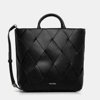
- What Colors to Avoid for Your Skin Tone | Easy Personal Style Checklist | Know What Colors to Avoid for My Skin Tone
- Calvin Klein Women’s Black Zip Tote Bag (a practical way to wear black away from the face if high-contrast dark tops feel too harsh)
Helpful references for color and skin considerations
For general skin considerations and sensitivity basics, see the American Academy of Dermatology Association. For a deeper look at how color is defined and communicated across industries, explore the Pantone Color Institute.
FAQ
What colour suits my skin tone online
Use a neutral daylight photo and compare warm vs. cool swatches side-by-side, then confirm with a real fabric test under your chin. Choose a “best white,” a “best neutral,” and one accent color as anchors so shopping decisions stay consistent across brands and screens.
Recommended for you

Calvin Klein Zip Tote: 13″ vs 15″ Laptop Fit Guide
May 29, 2026


Leave a comment